This dialog plots tables of predicted means following a regression or linear mixed model analysis. For a one-way table the factor for the x-axis should be supplied, and for a two-way table the grouping factor should be supplied as well as the X factor. If the X factor and grouping factor are left blank the first two-way table of predicted means in the analysis is plotted (i.e. for the first two classification factors in the table of predictions), or the first one-way table if there are no multi-way tables. For multi-way tables the means can be displayed in trellis plots.
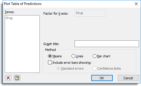
Terms
This lists factors that can be used for the X axis, Groups or Trellis Groups. Double-click on a factor name to copy it to the current input field; alternatively, you can type the name directly into the input field.
Factor for X-axis
Specifies the factor to be plotted on the X-axis. Corresponding y values are the predicted means at each level of the X factor.
Groups
If there are two or more classification factors in the table you can specify factors to use for additional classification on the plot. The means are calculated for each combination of X Factor and Groups, and a different colour is used when plotting means, lines and data for the different groups, according to the choice of Method. For multi-way tables a list of factors separated by commas or spaces can be supplied to display the means for each combination of the grouping factors.
Trellis groups
For a multi-way table where there are several classification factors you can specify factors to define a trellis plot where a different plot is produced for each level of the factor. A list of factors separated by commas or spaces can be supplied to display a plot for each combination of the trellis grouping factors.
Graph title
Specify a title for the plot. The title appears centred at the top of the graph. If you do not provide a title, an automatic title will be generated. If you do not want a title, enter a space in the title field.
Method
This controls how the means are to be displayed.
| Means | represents each mean by a point |
| Lines | also plots lines between the means |
| Bar chart | Plots the predicted means as a bar chart |
You can include error bars by selecting the Include standard error bars option. An error bar using the standard error of the predicted value will be plotted around each predicted value.
Action Icons
| Pin | Controls whether to keep the dialog open when you click Run. When the pin is up |
|
| Clear | Clear all fields and list boxes. | |
| Help | Open the Help topic for this dialog. |
See also
- DTABLE procedure for plotting tables of values
- Predictions from Simple Linear Regression
- Predictions from Simple Linear Regression (Grouped)
- Predictions from Multiple Linear Regression
- Predictions from Multiple Linear Regression (Grouped)
- Predictions from General Linear Regression
- Predictions from Generalized Linear Model
- REML Predictions