Use this to plot a table of data created using the Summary Tables or Frequency Tables menus. You can choose the type of data summary to use in the plot and how the table is to be displayed. For a one-way table the factor for the x-axis is automatically selected, however for multi-way tables you can choose which classification factor to use for the x-axis. For multi-way tables the data can be displayed using different colours on the same plot within a trellis plot.
Available factors
This lists factors that can be used for the x-axis, Groups or Trellis groups. Double-click on a factor name to copy it to the current input field; alternatively, you can type the name directly into the input field.
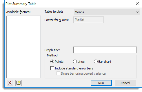
Table to plot
Specifies the type of summary to be used to plot in a table. The items displayed in this list will depend on whether this dialog was opened from the Summary Tables or Frequency Tables menus.
Factor for x-axis
Specifies the factor to be plotted on the x-axis. Corresponding y values are the data at each level of the x-axis factor. For one-way tables this field will be automatically filled in.
Groups
If there are two or more classification factors in the table you can specify a factor to use for additional classification on the plot. The means are calculated for each combination of x-axis factor and Groups, and a different colour is used when plotting means, lines and data for the different groups, according to the choice of Method.
Trellis groups
For a multi-way table where there are several classification factors you can specify factors to define a trellis plot where a different plot is produced for each level of the factor. A list of factors separated by commas or spaces can be supplied to display a plot for each combination of the trellis grouping factors.
Page groups
For a multi-way table where there are three or more classification factors you can specify factors to define which graphs are split across pages, where a different page is produced for each level of the factor. A list of factors separated by commas or spaces can be supplied to display a page for each combination of the page grouping factors.
Graph title
Specify a title for the plot. The title appears centred at the top of the graph. If you do not provide a title an automatic title will be generated. If you do not want a title, enter a space in this field.
Method
This controls how the means are to be displayed.
| Points | Represents data value by a point |
| Lines | Also plots lines between the data points |
| Bar chart | Plots the data as a bar chart |
For a plot of a table of means, skewness or kurtosis you can include error bars by selecting the Include standard error bars option. Selecting Single bar using pooled variance will plot a single pooled error bar alongside the data, otherwise an error bar will be plotted around each data point. The option to Include standard error bars is not available when expressing the tables as percentages.
Action Icons
| Pin | Controls whether to keep the dialog open when you click Run. When the pin is up |
|
| Clear | Clear all fields and list boxes. | |
| Help | Open the Help topic for this dialog. |
See also
- Summary tables menu
- Frequency tables menu
- Graphics Plot Table menu
- DTABLE procedure for plotting tables of values