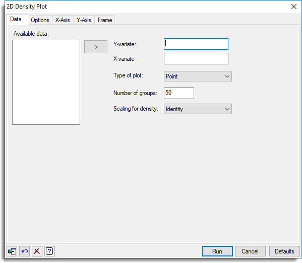
Select menu: Graphics | 2D Density Plot
Use this to specify data for a 2D density plot. A density plot provides a better visual representation of the 2-dimensional spread of points than a scatter plot if there are a large number of points or many points overlap each other, and is quicker to plot. A density plot displays the number of points in small rectangular regions of the x-y plane, using various methods to display the density. The density is the number of points falling into each rectangle. Set the number divisions of the ranges of the data in the x and y directions using Number of groups. A range of methods to display the density is provided with the Type of plot option.
- After you have imported your data, from the menu select
Graphics | 2D Density Plot. - Fill in the fields as required then click Run.
You can set additional options and axis settings by clicking the Options, X Axis, Y Axis and Frame tabs.
Use the Transform axis options on the Axis tabs to rescale the density plots. These transformations are applied internally to the definition of the rectangles formed to calculate the density in the DXYDENSITY procedure, and so cannot be changed interactively in the graphics viewer.
Available data
This lists data structures (factors and variates) appropriate to the current input field. Double-click a name to copy it to the current input field or type the name.
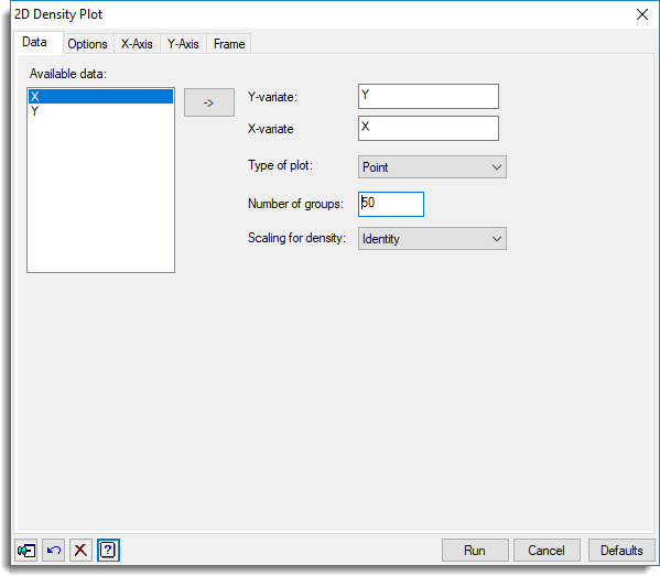
Y-variate
Specifies the y-coordinates of the points to be plotted. Double-click a name in the Available data field to copy it across or type the name.
X-variate
Specifies the x-coordinates of the points to be plotted. Double-click a name in the Available data field to copy it across or type the name.
Type of plot
You can specify how your data is displayed by selecting the appropriate type of plot. You can select from:
- Point – Points with their size proportional to the density are displayed in a scatter plot.
- Shade – The density is displayed as a colour in a shade plot.
- Contour – The density is displayed with contours and colour in a contour plot.
- Surface – The density is displayed as heights in a surface plot.
- Histogram – The density is displayed as heights in a 3 dimensional histogram.
Number of groups
This specifies the number of regions the x and y axis ranges will be divided into. A larger value more finely divides the ranges but take longer to compute and plot. The number of groups must be between 4 and 400. The appropriate value for best displaying a given data set depends on the number of observations, with smaller values being better for displaying data sets with fewer observations.
Scaling for density
Commonly the densities are very skewed, with a few very large values and with the rest being much smaller. In this case, the shading or scaling of the densities does not allow much separation of the lower densities, as the majority of the range is used in displaying the separation of the large values from the rest. Scaling the densities allows more of the colour separation or distances on the density axis to be used to better separate the lower densities.
- Identity – The densities are not scaled.
- Square root – The square root of the densities are displayed giving more emphasis to low densities.
- Percentile – The percentiles of the densities are displayed giving equal emphasis over the whole distribution of the data.
Action buttons
| Run | Produce the graph. |
| Cancel | Close the dialog without further changes. |
| Defaults | Reset options to their default settings. |
Action Icons
| Pin | Controls whether to keep the dialog open when you click Run. When the pin is down |
|
| Restore | Restore names into edit fields and default settings. | |
| Clear | Clear all fields and list boxes. | |
| Help | Open the Help topic for this dialog. |
Examples
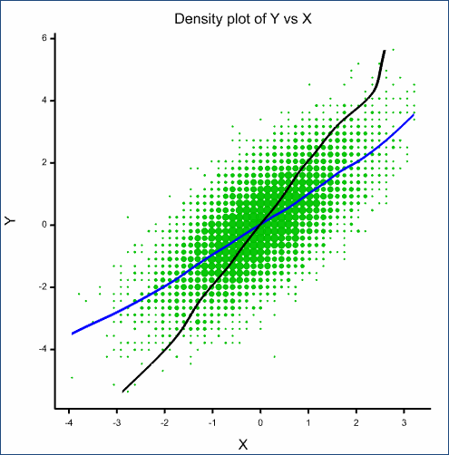
The following density plots use a dataset of 10000 points from a bivariate normal distribution with correlation of 0.7. The data is generated with the following server commands:
CALC [SEED=37] X,Y = GRNORMAL(10000)
CALC Y = Y + X
- Open a new text window by clicking
 on the top left of the toolbar.
 - Copy and paste the server commands shown above into the text window then from the menu select Run | Submit Window.
- From the menu select Graphics | 2D Density Plot and fill in the dialog as shown:
You can plot this data in a number of manners as shown below.
A point plot with both mean relationships, Y vs. X and X vs. Y displayed
- On the Options tab, change the Symbol, contour or bar colour to green.
- Select Intensity.
- Select the Y vs. X and X vs. Y options as shown below.
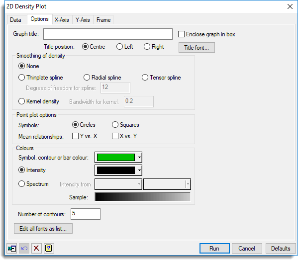
- Click Run to produce the following plot:
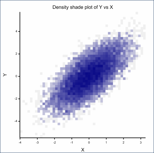
A shade plot using a percentile scaling of density and intensity of the colour black
- From the menu select Graphics | 2D Density Plot.
- On the Data tab enter Y for the Y-variate and X for the X-variate.
- Change the Type of plot to Shade.
- Change Scaling for density to Percentile.
- Click Run to produce the following plot:
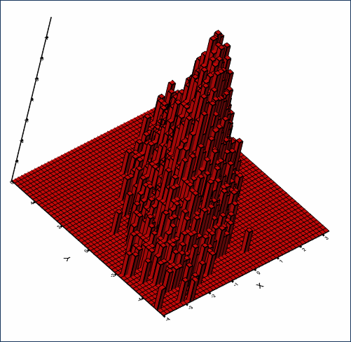
A histogram plot using a square root scaling of density (rotated in the graphics viewer)
- From the menu select Graphics | 2D Density Plot.
- On the Data tab enter Y for the Y-variate and X for the X-variate.
- Change the Type of plot to Histogram.
- Change Scaling for density to Square root.
- On the Options tab, change Symbol, contour or bar colour to red.
- Click Run to produce the following plot:
(Note: The plot below has been rotated by double-clicking the graph to put it in Editor mode, closing the dialog then clicking the hand button  This enables you to manipulate the graph.)
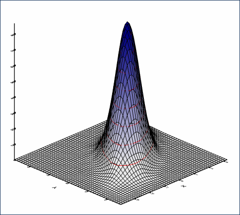
A surface plot with a kernel smooth with bandwidth equal to 0.1
- From the menu select Graphics | 2D Density Plot.
- On the Data tab enter Y for the Y-variate and X for the X-variate.
- Change the Type of plot to Surface.
- Change Scaling for density to Identity.
- On the Options tab, change Smoothing of density to Kernel density with a Bandwidth for kernel of 0.1. and choose the Spectrum option.
- Click Run to produce the following plot:
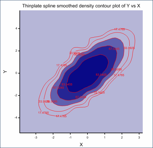
A contour plot using a percentile scaling of density with a thinplate spline smooth with d.f.=8 and 5 contours
- From the menu select Graphics | 2D Density Plot.
- On the Data tab enter Y for the Y-variate and X for the X-variate.
- Change the Type of plot to Contour.
- Change Scaling for density to Percentile.
- On the Options tab, change Smoothing of density to Thinplate spline.
- Set Degrees of freedom for spline to 8.
- Set the Number of contours to 5.
- Click Run to produce the following plot:
See also
- 2D Density Plot options tab menu
- Y axis, X axis and Frame options
- 2D Scatter Plot
- DXYDENSITY procedure