Select menu: Graphics | Trellis Plot
Use this to enter the data for a trellis plot, which is a rectangular array of plots, each presenting a particular graph for a particular subset of the data. For each subset of data you can draw histograms, boxplots or scatter plots.
- After you have imported your data, from the menu select
Graphics | Trellis Plot. - Fill in the fields as required then click Run.
You can set additional options settings by clicking the Options and Axis tabs.
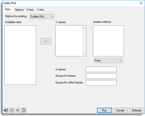
Available data
This lists data structures appropriate to the current input field. It lists the factors or variates for specifying the data. The contents will change as you move from one field to the next. Double-click a name to copy it to the current input field or type the name.
Method for plotting
This specifies the type of plot that will appear in each of the frames of the trellis plot. You can choose either Scatter plot, Histogram or Boxplot.
Y-values
Specifies the y-values of the data to be plotted. Double-click a name in the Available data field to copy it across or type the name. You can transfer multiple selections from Available data by holding the Ctrl key on your keyboard while selecting items, then click ![]() to move them all across in one action.
to move them all across in one action.
For a trellis of scatter plots, when a variate name is transferred from the Available data list the scatter method for the variate is set using the method within the dropdown list below the Scatter method field. You can change the scatter method for a variate within the Scatter method field by double-clicking on the variate in this list and selecting a new method.
Scatter method
For a trellis plot that displays the data as scatter plots you can choose how the data points are to be drawn. You can select from Point, Line, Mean, Median or Spline. When selecting either Mean or Median, a line is drawn to join the mean or median data values at each value of the x-values for each level of the group factor used within the frames. If a Spline is selected then this will be drawn using 4 df. For a trellis of scatter plots, when a variate name is transferred from the Available data list to the y-values list the scatter method for the variate is set using the method within the dropdown list below the Scatter method field. You can change the scatter method for a variate within the Scatter method field by double-clicking on the variate in this list and selecting a new method.
X-values
For a trellis of scatter plots this lets you specify the x-values to plot against the y-values. Double-click a name in the Available data field to copy it across or type the name.
Groups for frames
Specifies a factor to specify how the data are to be divided into separate plots or frames. A separate plot is drawn for each level of the factor. Double-click a name in the Available data field to copy it across or type the name.
Groups within frames
Use this to specify a factor to indicate that the data are partitioned into different groups. For a scatter plot the groups will then be identified on the plot by using different Genstat pens (where the pen number is given by the corresponding level of the factor). As a result, different colours will be used for units belonging to different groups. For a boxplot a separate box will be drawn for each level of the factor. Double-click a name in the Available data field to copy it across or type the name. Note that this option is not available when drawing histograms.
Action buttons
| Run | Produce the graph. |
| Cancel | Close the dialog without further changes. |
| Defaults | Reset options to their default settings. |
Action Icons
| Pin | Controls whether to keep the dialog open when you click Run. When the pin is down |
|
| Restore | Restore names into edit fields and default settings. | |
| Clear | Clear all fields and list boxes. | |
| Help | Open the Help topic for this dialog. |