Use this to set attributes to control the appearance of a Heatmap plot.
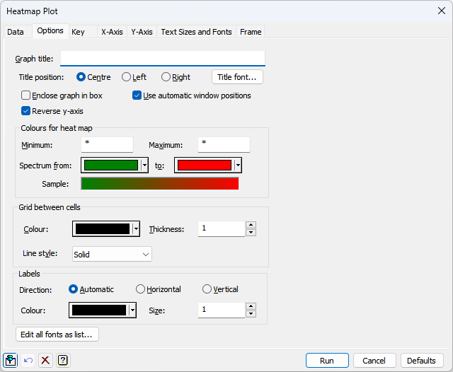
Graph title
Lets you enter a title for the graph. The title appears at the top of the graph.
Title position
You can position the title by selecting the Centre, Left or Right option.
Enclose graph in box
Select this to draw an enclosing box around the graph.
Use automatic window positions
Select this to place the heatmap and its key optimally within the full square frame. If the key is displayed, it will be placed either at the bottom or right of the page, depending on where it fits best. If no key is displayed, the heatmap uses the full frame. When this option is selected, the fields to set the heatmap and key positions are disabled in the Frame and Key tabs respectively.
Title font
This opens the Edit Font menu that lets you control the font for the title.
Colours for heatmap
These options let you control the colours that are used when drawing the heatmap. The Minimum and Maximum values give the values mapped to the start and end of the colour scale. The Spectrum from and to options let you specify the colours used to represent the minimum and maximum values. You can select the starting colour and ending colour by clicking the colour buttons to get the pop-up colour selector to choose a new colour. An example of the changing spectrum is shown in the Sample field. The minimum must be less than or equal to the minimum data value. The maximum must be greater than or equal to the maximum data value. The default value of *, i.e a missing value, automatically uses the minimum and maximum of the data for the Minimum and Maximum respectively. The FHEATCOLOURS procedure is used to interpolate values between the minimum and maximum to a colour on the spectrum.
Grid between cells
These items control the colour, line style and thickness of the outlines drawn around each cell in the x-y grid. Click Colour to get the pop-up colour selector to choose a new line colour. The Line style drop-down list can be used to select the line style used. The Thickness option specifies the thickness (a number between 0 and 10) of the line used. See the PEN directive for more information.
Labels
The items control the direction, colour and size of the labels that are drawn within each cell in the x-y grid. The Direction controls how the labels is oriented. The Automatic option orients the label either horizontally or vertically to best fit the label within the cell. The Horizontal setting displays the label horizontally (i.e., from left to right) and the Vertical setting displays the label from vertically (i.e., from bottom to top). Click Colour to get the pop-up colour selector to choose a new colour for the labels. The Size option specifies the relative size (between 0 and 10) of the labels.
Edit all fonts as a list
Clicking this opens the Edit All Fonts as a List menu which allows all the fonts in the graph to be set in one place.
Action buttons
| Run | Produce the graph. |
| Cancel | Close the window without further changes. |
| Defaults | Reset the options to their default settings. |
See also
- Heatmap Plot data tab menu
- Y axis, X axis and Frame options
- Key tab menu
- Edit font dialog
- Text Sizes and Fonts options
- Edit All Fonts as a List
- Graphics Menu
- DHEATMAP procedure
- FHEATCOLOURS procedure