Select menu: Graphics | 1D Density Plot
Use this to specify data for a density plot (also know as a violin plot), where the values are plotted along a line, and a kernel smooth of the density (using the KERNELDENSITY procedure) is plotted on both sides of the line as an envelope around the points.
- After you have imported your data, from the menu select
Graphics | 1D Density Plot. - Fill in the fields as required then click Run.
You can set additional options and axis settings by clicking the Options, Symbols, X Axis, Y Axis and Frame tabs. Note, the Y axis can be transformed by setting the transformation on the Y axis tab, but the transformation of the X axis is ignored. Some other aspects of the axes tabs are also ignored in the plot.
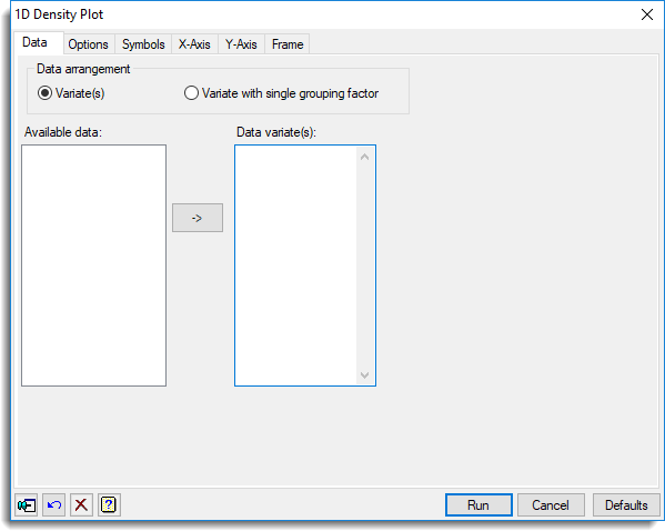
Data arrangement
You can specify how your data is formatted by selecting the appropriate type of plot. When an item is selected the fields will change on the menu. You can select from:
| Variate(s) | One or more variates added to the list |
| Variate with single grouping factor | A single variate and a factor whose groups will be plotted separately |
Available data
This lists data structures appropriate to the current input field. It lists either factors or variates for specifying the data. The contents will change as you move from one field to the next. Double-click a name to copy it to the current input field or type the name.
Data variate(s)
Specifies the y-coordinates of the points to be plotted. Double-click a name in the Available data field to copy it across or type the name. You can transfer multiple selections from Available data by holding the Ctrl key on your keyboard while selecting items, then click ![]() to move them all across in one action. You can set the choice of plotting method, symbols and colours for each variate by clicking the Symbols tab.
to move them all across in one action. You can set the choice of plotting method, symbols and colours for each variate by clicking the Symbols tab.
Grouping factor
Use this to to specify a factor indicating that the points are partitioned into different groups. but only for the data arrangement Variate with single grouping factor. The groups will then be identified on the plot by using different Genstat pens (where the pen number is given by the corresponding level of the factor). As a result, different colours will be used for units belonging to different groups. Double-click a name in the Available data field to copy it across or type the name.
Action buttons
| Run | Produce the graph. |
| Cancel | Close the dialog without further changes. |
| Defaults | Reset options to their default settings. |
Action Icons
| Pin | Controls whether to keep the dialog open when you click Run. When the pin is down |
|
| Restore | Restore names into edit fields and default settings. | |
| Clear | Clear all fields and list boxes. | |
| Help | Open the Help topic for this dialog. |
See also
- 1D Density Plot options tab menu
- Symbols tab menu
- Y axis, X axis and Frame options.
- Histogram
- Boxplot
- Dot Histogram
- DXDENSITY procedure
- KERNELDENSITY procedure