Select menu: Stats | Microarrays | Explore | 2D Plots
Use this to produce 2D plots of microarray data or transformed data using log base 2. You can display separate plots for all slides or use a subset of these. Alternatively, you can display all the plots within a single graph using a trellis plot. For each of the plots you can add a reference and mean curve.
- After you have imported your data, from the menu select
Stats | Microarrays | Explore | 2D Plots. - Fill in the fields as required then click Run.
You can set additional Options before generating the graph.
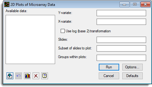
Available data
This lists data structures appropriate for the field which currently has focus. Double-click a name to move it to the currently selected field or type the name.
Y variate
The variate(s) to be plotted on the Y axis of the plot.
X variate
The variate(s) to be plotted on the X axis of the plot.
Use log (base 2) transformation
The Y and X variates are log 2 transformed before plotting. The calculation for this using Genstat’s command language is:
CALC LogY = LOG(Y)/LOG(2)
Slides
The factor that identifies the slides. If just a single slide is being displayed, this does not needed to be provided.
Subset of slides to plot
If you only want plots of some of the slides in the data set, you can provide a list of the levels or labels of the slides you want. The labels should be separated by commas. If the labels have spaces in them, quote them with single quotes, e.g. ‘MS 1′,’MS 2’, ‘MS 3’.
Groups within plots
A factor that indicates groups within each graph which are to be plotted in different colours.
Action buttons
| Run | Generate the graphs. |
| Cancel | Close the dialog without further changes. |
| Options | Opens a dialog where additional options and settings can be specified for the graphs. |
| Defaults | Reset the menu back to the default settings. Clicking the right mouse on this button produces a shortcut menu where you can choose to reset the menu using the currently stored defaults or the Genstat default settings. |
Action Icons
| Pin | Controls whether to keep the dialog open when you click Run. When the pin is up |
|
| Restore | Restore names into edit fields and default settings. | |
| Graphics Output | Controls how graphs are to be drawn. You can either draw the graph in the Graphics View or save direct to files (JPEG, TIFF, EPS, EMF, GMF, BMP or PNG). | |
| Clear | Clear all fields and list boxes. | |
| Help | Open the Help topic for this dialog. |
Example
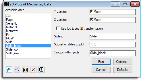
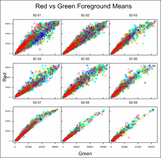
The following example shows how to plot the foreground means of the red and green dyes against each other (i.e. F1Mean vs F2Mean), with different print tips (in factor Slide_block) for a subset of 9 slides in the experiment (Test_Slides.gsh).
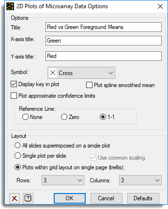
The options have the titles provided, and specify a 1-1 reference line within a trellis plot.
This produces in the following graph:
See also
- 2D Plots of Microarray Data Options
- Microarray menus
- Two channel microarray example
- Histograms
- Spatial Plot
- Volcano Plot
- Microarray procedures
- MAPLOT procedure for producing 2D plots of microarray data using commands