The following example shows how to analyse data from a two channel microarray experiment. The data in this experiment are from a mouse knock out experiment with 6384 genes per slide. There were 16 slides, 8 control mice and 8 knock out mice all on the red dye compared to a standard reference on the green dye. Note that this design is not dye balanced, as there are no dye swaps as the reference is always on red.
Import the example data
The data are stored in the file ApoAISlides.csv. This and other files needed to follow the example below are stored in this downloadable Microarrays.zip file. These should then be unzipped to the folder C:\Program Files\GenxxEd\Data. (Replace ‘xx‘ with your Genstat version number e.g. ‘Gen21Ed’. This will create a Microarrays folder under Data).
If you do not have rights to unzip files to that directory, then they can be placed in any directory, but will not be found in the File | Open Example Data Sets menu.
If you are unsure of how to unzip the files, then opening the Microarrays.zip file with File | Open will let you select a file from the zip file.
- From the menu select File | Open then navigate to the Microarrays folder location..
- Select ApoAISlides.csv then click Open.
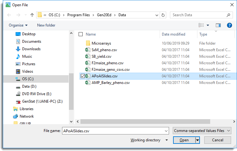
When a .csv file is opened in Genstat you have the option of opening it into a text window, or into a spreadsheet.
- Click Read to open the data into a spreadsheet.
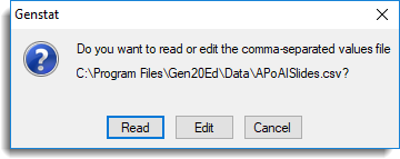
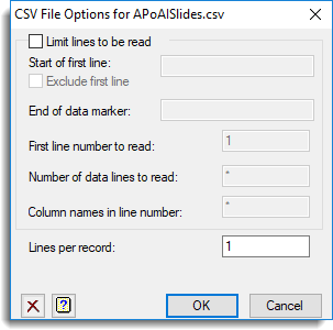
When opening .csv files you are prompted with two dialogs where additional options can be specified to control how the data are opened. The first dialog (as shown below) has options for controlling which rows of the data are to be opened.
- Read in the whole file by clicking OK.
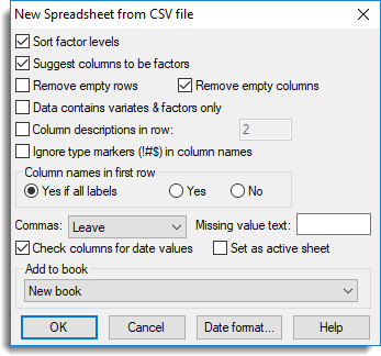
The second dialog contains further options for controlling how the data are to be opened including data type conversion and location of column names.
- Accept the default settings by clicking OK.
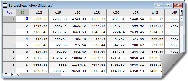
This opens the spreadsheet.
Reshape the data by stacking columns
Within the spreadsheet the data have two columns for each slide. To analyse the data it needs to be in stacked format where all the red values are within one column and all the green values are stacked in another column. To reorganise the data the stack menu can be used.
- From the menu select Spread | Manipulate | Stack.
- The dialog below shows the settings for stacking the columns together.
- In the Number of columns to stack together field type ’16’.
- In Record column source in factor type ‘Slide’.
This will become a column in the new spreadsheet to index the stacked columns. - Click inside the Repeat columns field to give it focus then in the Available data field double-click ID to move this across.
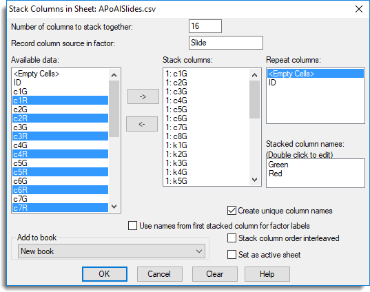
- To select columns to stack, click inside the Stack columns list to give it focus.
- Now hold down Ctrl and select every item ending in G from the Available data list.
- Click
 to move these into the Stack columns list.
 - Repeat the above step, selecting all items ending in R.
- In the Stack column names list, double-click the default name c1G_1 and change the name to ‘Green’ then click OK.
- Repeat the above step to change c1R_1 to ‘Red’.
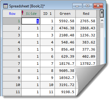
- Clicking OK on the Stack Columns in Sheet dialog will produce a spreadsheet as follows:
Merge with another spreadsheet
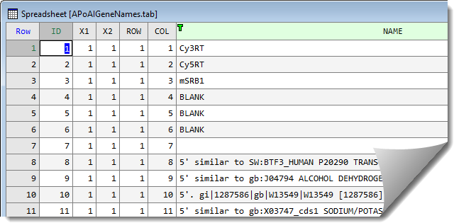
Additional information on the genes and layout of the slides located within another file, ApoAIGeneNames.tab.
- From the menu select File | Open then navigate to the file to select and open it.
- As with the previous file, you will be prompted with two dialogs. Accept the defaults and click OK twice.
- A third dialog will prompt you to convert columns to different types. Click Leave all then click OK.
The information from the ApoAIGeneNames.tab data set needs to be merged into the stacked spreadsheet.
- To merge two spreadsheets click on the spreadsheet that the data is to be merged into to give it focus (in this case your previously stacked spreadsheet).
- From the menu select Spread | Manipulate | Merge to open a dialog as shown below.
The two spreadsheets are to be merged using the column ID to match columns between the spreadsheets.

- In the Merge data from sheet list select Spreadsheet [ApoAIGeneNames.tab].
- In the Matching column dropdown lists, match column ID_1 with column ID as shown above.
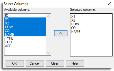
- Click Select columns to transfer then select X1, X2, ROW, COL and NAME then click to move them across and click OK.
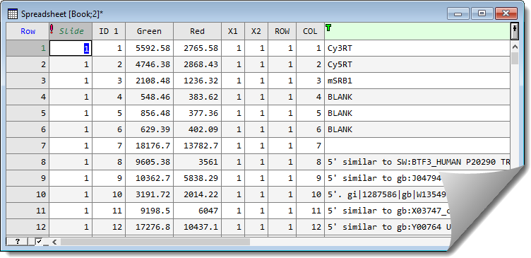
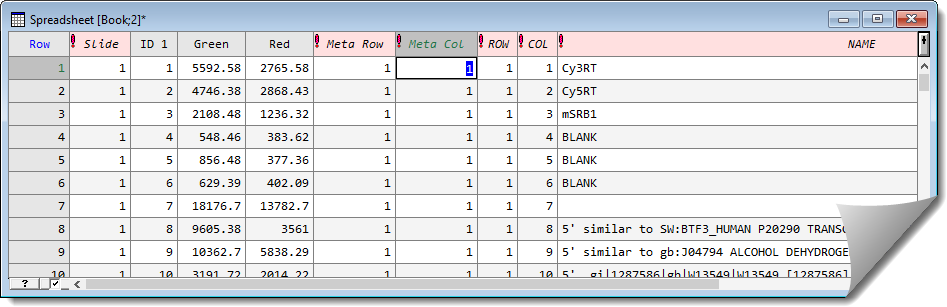
- Click OK on the Merge Sheet dialog to perform the merge. The merged spreadsheet displays. (You may need to drag the right-edge of the spreadsheet to see the newly merged columns).
Convert columns to factors then combine factor products
The column X1 is the position of the pins across the slide, and X2 is the column position.
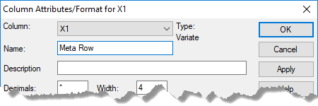
- Rename these with more informative names by double-clicking the column heading of X1 and entering ‘Meta Row‘ in the Name field then click OK. Repeat this step to rename X2 to ‘Meta Col‘.
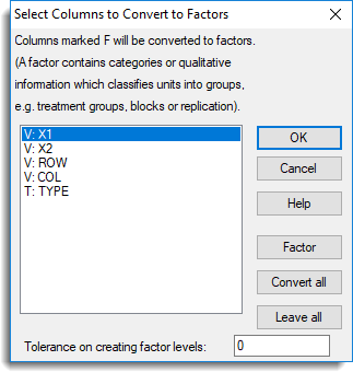
The columns which index the row and columns or the pins (Meta Row and Meta Col), the rows and columns within pins (ROW and COL) and the gene names (NAME) need to be converted to factors.
- Select all 5 columns by clicking the column header Meta Row then hold down the Shift key and click NAME.
- Now right-click within the selected columns and select Convert to factor.
- A prompt will appear, warning you that the NAME column characters will be truncated: click OK.
After conversion the factor columns will be indicated by an exclamation mark at the start of the column name.
The row and column positions across the whole slide are required for the analysis. These can be formed by using the factor product of Meta Row with ROW and Meta Col with COL respectively.
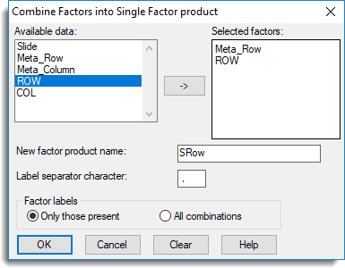
- From the menu select Spread | Factor | Product/Combine.
- Double-click Meta Row and ROW to move them into the Selected factors field.
- Type SRow as the New factor product name.
- Enter a comma ‘,’ as the Label separator character then click OK.
- Repeat the above step to combine Meta Col with COL, giving it the name SCol.
Note: If you want to analyse the data using the normalization menu (instructions follow below) the factors Meta Row and Meta Col will need to be combined to form a factor Pin representing the pins.
Calculate log ratios
To measure the level of differential expression between the two treatments on a slide the log-ratios can be calculated.
- Firstly we’ll close any spreadsheet we’re no longer using and clear all data from the server so that only the relevant data will display in the next dialog.
- Close the spreadsheets APoAISlides.csv and ApoAIGeneNames.tab. If you are prompted to update the data in the server with current values click No.
- From the menu, select Data | Clear All Data then click Yes. Now click the spreadsheet you’ve been working on to give it focus.
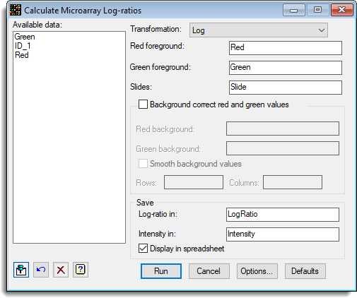
- To calculate the log-ratios, from the toolbar select Stats | Microarrays | Calculate | Log-ratios.
- The dialog below shows the settings that can be used to calculate the log-ratios for this data set. Fill out the dialog as shown then click Run.
Producing graphs
The data on the slides can be explored by using the graphical menus available within Stats | Microarrays | Explore.
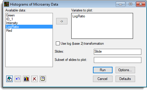
- For example, you can select Stats | Microarrays | Explore | Histograms to produce histograms of the data.
The following shows the settings for plotting a histogram of the log-ratios by slide.
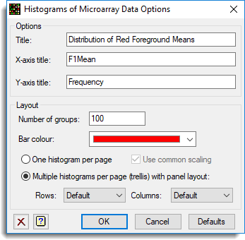
- You can plot the histograms in a trellis layout using the options. To use the trellis layout click on the Options button and set the resulting dialog options as follows:
This produces the following graph.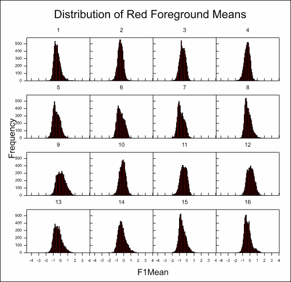
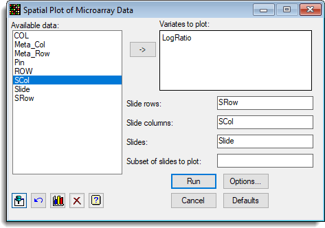
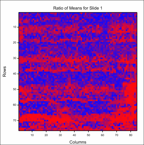
- The spatial variation across the slides can be examined by selecting Stats | Microarrays | Explore | Spatial Plots.
The following dialog shows the settings that can be used to produce a spatial plot for each slide.
- Fill in the dialog as shown, putting the cursor into a field to give it focus before double-clicking items to move them into the selected field. The items shown in Available data will update as you move from field to field.
This is the image of the first slide:
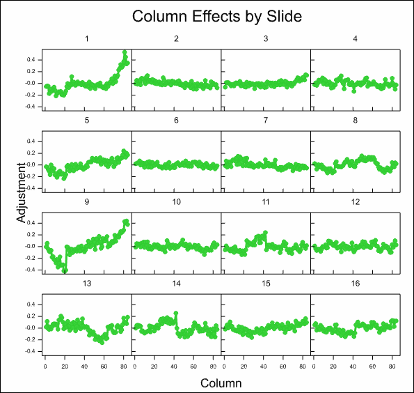
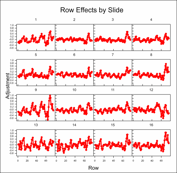
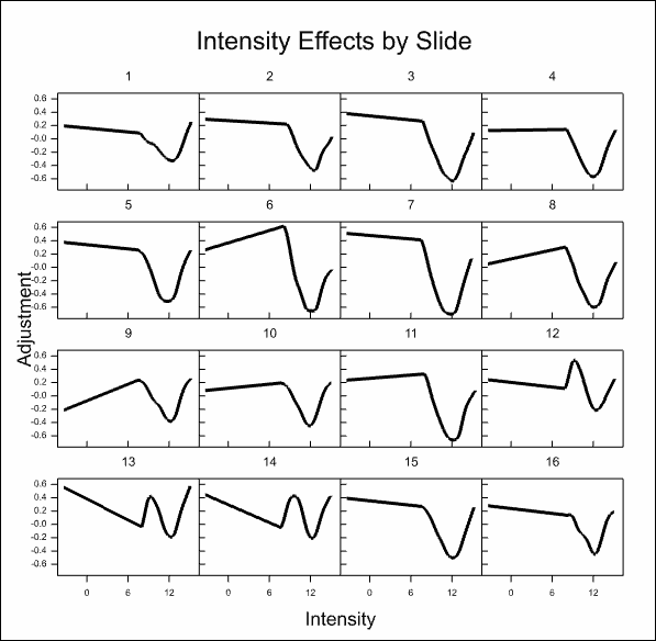
Using normalization to remove dye intensity and spatial effects
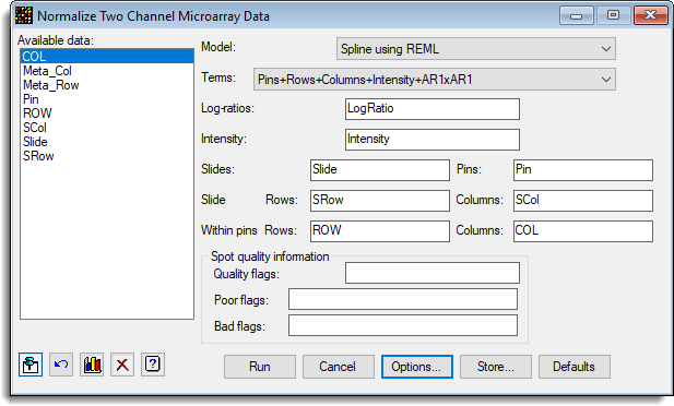
Dye intensity and spatial effects (pins, rows and columns) can be removed from the slides by using the Normalization menu.
- Select Stats | Microarrays | Normalize | Two Channel.
- The dialog below shows the settings that can be used to normalize the data. The factor Pin should have been created as the Factor Product of Meta Row and Meta Col as described in the section above Convert columns to factors then combine factor products.
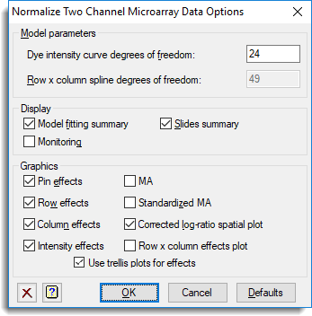
- To automatically include plots click Options and set the options as follows.
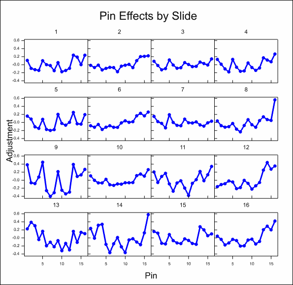
- Click OK to close the dialog then click Run to produce the graphs and output.
After some time, the resulting graphs display the effects that have been estimated:
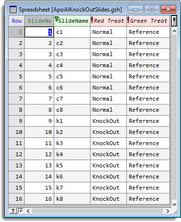
Analyse the microarray estimates from log-ratios
- To analyse the results across the 16 slides, open the spreadsheet ApoAIKnockOutSlides.gsh, which contains the structure of the experiment.
- From the menu select Stats | Microarray | Analyse | Estimate Two Channel Effects.
- The image below shows the resulting dialog containing settings to run the analysis.
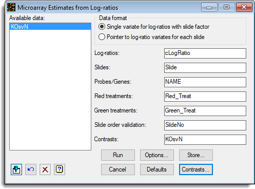
- To estimate the difference between the control and knock out treatments click Contrasts to define a contrast matrix.
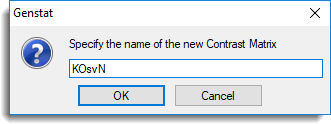
- Type the name ‘KOsvN’ and click OK.
- Enter the number of contrasts as 1 then click OK to create the matrix spreadsheet.
- Edit the spreadsheet values to look like the image below. You can edit a cell by placing the cursor inside it and edit a column heading by double-clicking.
Note: the reference level is specified as 0 as it is not required in this contrast.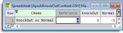
- In the Microarray Estimates from Log-ratios dialog, click Store.
- To save the results into the named data structures, accept the defaults and select Display in spreadsheet, then click OK.
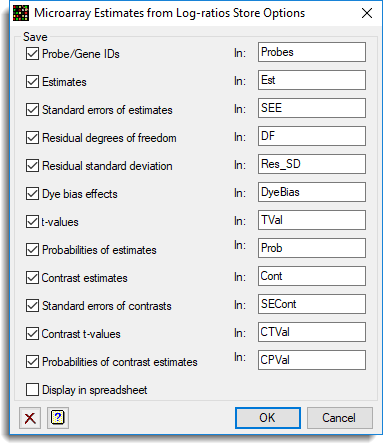
- Click Options and deselect Estimate dye bias from dye swaps as this is not required.
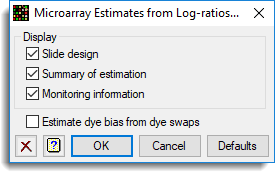
- Click OK to close the dialog then click Run to run the analysis and display the results in a spreadsheet.
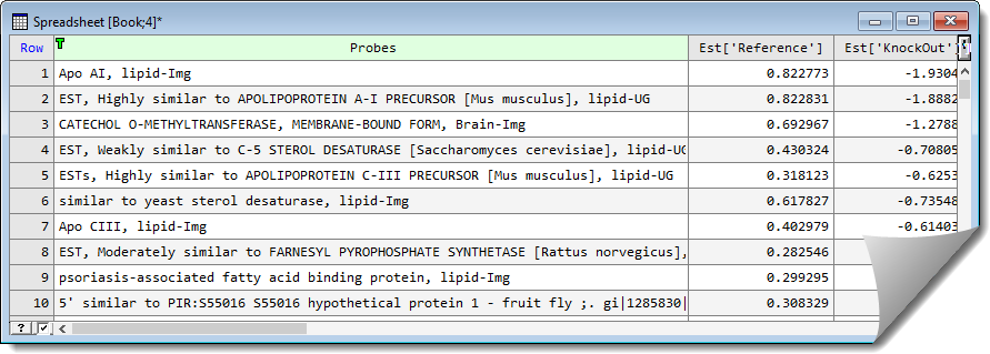
- To sort the spreadsheet by the contrast select Spread | Sort.
- Select the column Cont[‘KnockOut vs Normal’] then click OK.
When sorted we can see that the APO gene has the largest level of differential expression (as below).
Adjust the estimated standard errors
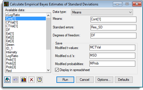
To adjust the estimated standard errors to each gene by the use of the information across all genes you can use Empirical Bayes Error Estimation. This shrinks the standard errors towards an estimated prior distribution, making the t values and probabilities more stable.
- select Stats | Microarrays | Analyse | Empirical Bayes Error Estimation.
- Fill in the dialog as shown below then click Run.
False discovery rate
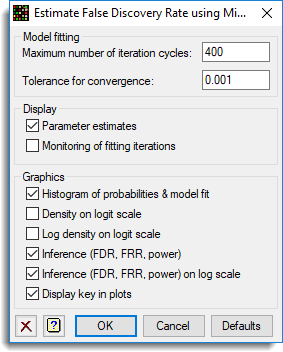
- The false discovery rate can be examined by selecting Stats | Microarrays | Analyse | False Discovery Rate by Mixture.
- Fill in the dialog as shown below then click Options.
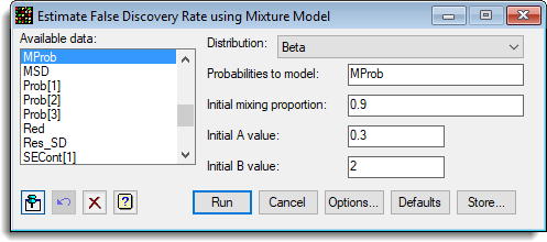
- Select options as shown and click OK, then Run the analysis.
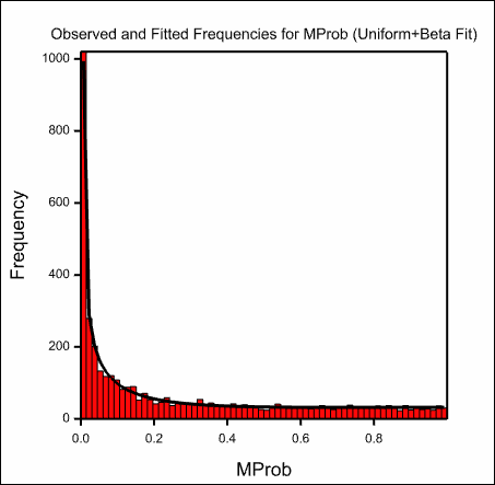
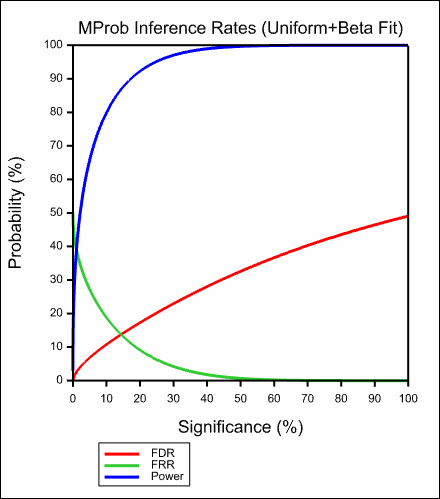
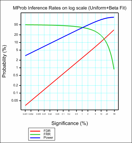
The images below show the resulting graphs.
See also
- Microarray Menus
- Two channel microarray design menu
- Open microarray data files
- Histogram menu
- Density plot menu
- 2-D plots menu
- Spatial plot menu
- Normalize two channel microarray menu
- One channel quantile normalization menu
- Calculate Affymetrix expression values menu
- Estimates from log-ratios menu
- One channel ANOVA menu
- Empirical Bayes estimates menu
- False discovery rate using mixture models menu
- Volcano plot menu
- Cluster probes/genes menu
- Cluster targets/slides menu
- Two-way clustering menu