Use this to set the attributes for plotting least significant intervals for a set of means.
Least significant intervals (LSIs) are used for comparing a set of predicted means graphically, especially when their SEDs differ. LSIs are intervals (or error bars) that are designed to overlap where there is no significant difference between estimates, and to be disjoint (i.e. not to overlap) where there are significant differences. This menu controls the titles, symbols and size of the labels used in the graph, and also allows you save or print the intervals. The LSIs are produced and plotted using the SEDLSI and LSIPLOT procedures.
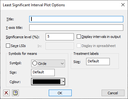
Title
This gives the title for the plot. If this field is left empty, a default title is used. To suppress the default title, use a single space in the field.
Y-axis title
This gives the y-axis title for the plot. If this field is left empty, a default title is used. To suppress the default title, use a single space in the field.
Significance level (%)
This specifies the significance level as a percentage for the least significant intervals. It is the probability that two treatments intervals overlap under the null hypothesis that there is no difference between their means. The level must be between and 0 and 100%.
Display in intervals in output
Select this to display the intervals and the maximum discrepancy in the intervals in the Output window.
Save LSIs
If this item is ticked, then the LSIs will be save in a pointer whose name is specified in the In: field. The pointer will contain 4 columns with suffixes of ‘Label’, ‘lowLSI’, ‘estimate’, and ‘upLSI’ giving the treatment labels, lower limit of the intervals, the treatment means and upper limit of the intervals respectively.
Display in spreadsheet
Select this to display the saved LSIs in a new spreadsheet window.
Symbols for means
These items let you control the size, shape and colour of symbols used to plot the means.
Symbol
Lists the different symbols that you can use to represent the means in the graph. Select the type of symbol you want to use for the graph.
Symbol Size
Lets you specify an amount by which the standard size of the symbols are to be multiplied. The value 1 represents the standard size. For example a value of 1.5 would increase the size of the symbol by 50% and a value of 0.5 would halve the symbol size. The Default setting will scale the symbol size according to the number of treatments in the graph. If the field is left empty the default setting will be used.
Symbol Colour
Lets you specify the colour of the symbol. Select the colour you want to use for the symbols in the graph.
Treatment labels size
This controls the size of the labels giving the treatment names on the x-axis of the graph. This is a size multiplier between 0 and 20. A value of 1 will give the standard label size. The Default setting will scale the label size according to the number of treatments in the graph. If the field is left empty the default setting will be used.
Action buttons
| OK | Save the attributes set. |
| Cancel | Close the dialog without further changes. |
Action Icons
| Clear | Clear all fields and list boxes. | |
| Help | Open the Help topic for this dialog. |
See also
- Predictions from Simple Linear Regression
- Predictions from Simple Linear Regression (Grouped)
- Predictions from Multiple Linear Regression
- Predictions from Multiple Linear Regression (Grouped)
- Predictions from General Linear Regression
- Plot table of predictions
- Further Output
- Change Regression Model
- Saving Results
- Save Individual Regression Terms dialog
- Save regression results in a spreadsheet
- Fitted Model for graphical display of the model
- Model checking
- Multiple Comparisons for Predictions options
- Linear Regression for information on general options and other models
- Simple Linear Regression
- Simple Linear Regression (with Groups)
- Multiple Linear Regression
- Multiple Linear Regression (with Groups)
- General Linear Regression
- Generalized Linear Models menu
- SEDLSI procedure
- LSIPLOT procedure