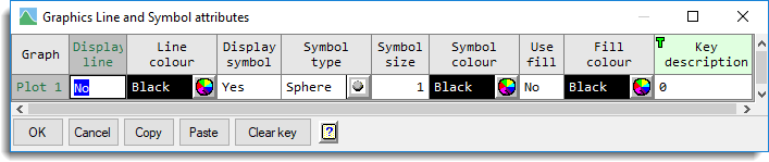
This spreadsheet is accessed by clicking the Edit attributes as list button from the Lines and Symbols tab of a 2D line plot, 2D or 3D scatter plot or a polar plot.
Use this to change attributes for lines, symbols and key descriptions simultaneously when there is a multiple series or groups being plotted. The attributes that are displayed will be relevant to the type of graph being drawn. The settings for each series and group are displayed in rows within the spreadsheet where the values can be changed. Some columns such as symbol types or line styles contain a restricted set of possibilities and for these columns cells can be filled by only entering the first letters of a word that uniquely identify an option. Also some columns such as line styles or symbols accept a numerical value where this value corresponds to those that can be used in the Genstat command language.
Selecting cells
Cells for copying or pasting can be selected by dragging with the mouse from the current cell, or by selecting whole columns by clicking on the column heading. Selections can also be created using the SHIFT key with the cursor movement keys (up-arrow, down-arrow, page up, page down, end and home keys). The left and right arrows move within a cell. For example, if you have set the Line colour column and want the symbols to be the same colour, you could click on the Line colour heading to select that column, press CTRL+C to copy the colours to the clipboard and then click on the Symbol colour heading and press CTRL+V to paste them to that column. Note: Cut (CTRL+X) only works for the Key description as the other columns cannot be empty.
Entering colours
When a name for a colour is entered within a cell, if it matches a named colour in Genstat, then the colour name will be displayed in the cell, otherwise the RGB value (0 = black, 16777217 = white) will be displayed. A colour can be entered by double clicking the cell or clicking on the colour selector icon at the right of the cell. A colour may also be entered by typing the name or RGB value into the cell. Hex RGB values of the format 0xHHHHHH (H = 0-9, A-F) can also be entered. In this format the first two digits specify the blue component, the next two the green component and the last two digits the red component.
For example, 0xFF0000 will specify blue, 0x00FF00 green and 0x0000FF red. Colour names are not case sensitive and can be automatically filled by only specifying the first letters that uniquely identify the name of a colour. If letters are entered that do not uniquely identify a colour name then the colour with the shortest name will be selected. In the case where there are more than one colour name of the same length the more common colour name will be used. For example, R = red, G = gold (not green as this has more letters), B = blue (not black as this has more letters), W = white (not wheat as white is more common) and P = pink (not plum or Peru as pink is more common). If a colour name does not completely match the start of existing colour, you will be prompted to select the closest matching colour.
Graph
Lists the plots for you to specify the line or symbol attributes. If groups have been specified on the data menu then these will be shown in the list for each graph. The groups are represented by the ordinal values and you can set line/symbol and key attributes for each different level of the group. The format is “Plot <i>” where the number i is the series to be plotted, or “Plot <i> – Group <j> when there are groups, and j gives the ordinal value of the group.
Display line
Lets you control whether a line or curve (depending on the selection of Line method) is plotted between points. When a cell contains Yes, a line or curve will be plotted, and if a cell contains No, then no line or curve will be drawn. You can change a cell to Yes by entering Y, y or 1 and change a cell to No by typing N, n or 0.
Note for 3D scatter plots, all plots must have the same setting for showing lines, so changing one cell in this column changes all the cells in the column.
Line style
Specifies the different line styles that can be used for each item. The style is shown in an icon on the right of the cell. A new line style can be selected by clicking this icon or by double clicking the cell. This will open a pop-up dialog where you can select a line style form a list Line styles can be entered by typing just the first few letters of the word that uniquely identifies the style. If the text typed matches two styles (e.g. D = dot or dash or dot dash, then a line style will be chosen based on the lower value used by the Genstat command language (see the table below). Alternatively, the numerical values representing a line style in the Genstat command language can be entered or an abbreviation can be used as show in the table below:
| Value | Line style | Abbreviation |
| 1 | Solid | S |
| 2 | Dot | D or . |
| 3 | Dash | Da or – |
| 4 | Dot dash | DD or .- |
| 5 | Tight dash | T |
| 6 | Long dash | L |
| 7 | Short dash | SH or S- |
| 8 | Close dot | C or C. |
| 9 | Fine dot | F |
| 10 | Double dot dash | DOU or ..- |
Line method
Specifies how the line is to drawn through the plotted points. You can either select line to draw straight lines or monotonic, open and closed to draw smoothed curves. The method can be selected by typing (case is ignored) the first character of the methods, or by double clicking the cell. This gives a list of the methods available that you can choose from within a pop-up dialog.
The monotonic setting specifies that a smooth single-valued curve is to be drawn through the data points. The name is derived from the requirement that the x-values (rather than the fitted curve) must be strictly monotonic, so that there is only one y-value for each distinct x-value. To ensure this, a copy of the data is made and sorted before the curve is fitted. This setting is recommended for plotting curves fitted to data. You should ensure that the points are close enough for the plotted line to be a reasonable approximation. When you know the functional form of the curve, it may be advantageous to calculate extra points. The open and closed settings specify that a smooth, possibly multi-valued, curve is to be drawn through the data points; the resulting curve is rotationally invariant, although not invariant under scaling. The closed setting connects the last point to the first. The open or closed methods are more suited to the situation where the plotted curve is intended to represent the shape of an object. The Spline setting plots a smoothing spline fitted through the points. By default four degrees of freedom are used in the spline, however, you can change this by supplying another value in the Degrees of freedom option (only available on the Line and Symbols tab). The Spline setting is not available for Polar plots. This field is not available for 3D plots as only straight lines can be used in them.
Line thickness
Lets you specify an amount by which the standard thickness of the plotted lines are to be multiplied by. The value 1 represents the standard thickness used. This is a decimal value which must be positive and less than 100. For example, a value of 1.5 would create a line 50% thicker than the standard line.
Line colour
Lets you specify the colour of the line.
Display symbol
Lets you control whether a symbol is plotted at the points. When a cell contains Yes, symbols will be plotted, and if a cell contains No, then symbols will be drawn. You can change a cell to Yes by entering Y, y or 1 and change a cell to No by typing N, n or 0.
Note for 3D scatter plots, all plots must have the same setting for showing symbols, so changing one cell in this column changes all the cells in the column.
Symbol type
Lists the different symbols that you can use to represent the points in the graph. The selected symbol is shown in an icon on the right of the cell. A new symbol type can be selected by clicking this icon or by double clicking the cell. This will open a pop-up dialog where you can select a symbol type form a list. Symbol types can be entered by typing just the first few letters of the word that uniquely identifies the symbol name. If the text typed matches two symbol names, then a symbol will be chosen based on the lower value used by the Genstat command language (see the table below). For example, C will select cross and not circle as cross has a lower value (1 vs. 2). Similarly, CI will select circle and not circle-cross. Alternatively, the numerical values representing a symbol in the Genstat command language can be entered or an abbreviation can be used as shown in the table below:
| Value | Symbol | Abbreviation |
| 1 | Cross | C or x |
| 2 | Circle | CI or O |
| 3 | Plus | P or + |
| 4 | Star | S |
| 5 | Square | SQ |
| 6 | Diamond | D |
| 7 | Triangle | T |
| 8 | Nabla | N |
| 9 | Asterisk | A or * |
| 10 | Minus | M or – |
| 11 | Heavyminus | HM or H- |
| 12 | Heavyplus | HP or H+ |
| 13 | Heavycross | HC or Hx |
| 14 | Smallcircle | SM or SO |
| 15 | Tinycircle | TI or TO |
| 16 | Female | F |
| 17 | Male | MA |
| 18 | Rhombus | R |
| 19 | Circle-cross | CC or Cx |
| 20 | Circle-plus | CP or C++ |
| 21 | Square-cross | SC or Sx |
| 22 | Square-plus | SP or S+ |
| 23 | User | U |
| -1 | Sphere | SPH |
| -2 | Cone | CO |
| -3 | Cylinder | CY |
| -4 | Cube | CU |
Symbol size
Lets you specify an amount by which the standard size of the symbols are to be multiplied by. The value 1 represents the standard size used. This is a decimal value which must be positive and less than 100. For example, a value of 1.5 would create a symbol 50% bigger than the standard size.
Symbol colour
Lets you specify the colour of the symbol. Select the colour you want to use for the symbols in the graph.
Use fill
Lets you specify that the symbol is filled with colour. If the cell shows Yes, a symbol will be filled, and if No, it will not be filled. You can change a cell to Yes by entering Y, y or 1 and change a cell to No by typing N, n or 0.
Fill colour
Lets you specify the fill colour for the symbol, which is only used if the corresponding Use fill cell is set to Yes. This must be set after the Symbol colour cells, as when the Symbol colour cells are set, the Fill colour is set to the same colour automatically.
Area colour (1D Density Plot only)
Lets you specify the shaded area colour between the density curves for a 1D Density plot. Select the colours you want to use to fill the shaded area in the graph.
Key description
This displays the text that will be used in the key of the graph. If an entry is empty, the plot item will have no description in the key.
Fill all cells within a column with changes
When this is selected, each change to a cell is made to all cells in the same column. For example, when this option is selected if you want to draw a graph where each series that has the same circle symbol filled with the same colour then you would only need to enter Y in any Display symbol cell, Circle in any Symbol type cell and Y in any Use fill cell.
Action buttons
| OK | Save the changes and close the spreadsheet. |
| Cancel | Close the spreadsheet without further changes. |
| Copy | Copy the selected spreadsheet cells to clipboard. |
| Paste | Paste clipboard to the spreadsheet. |
| Clear key | Clear the key description column. |
| Help about this menu. |
See also
- Line and Symbols tab menu
- 2D Scatter Plot
- 2D Line Plot
- 3D Scatter Plot
- 1D Density plot
- Scatter Plot Matrix
- Polar Plot
- Key tab menu
- PEN directive
- DGRAPH directive